Visualizing evolutionary algorithms
I designed this for two 9th graders during their week-long lab internship. The goal: explain evolutionary algorithms in a way you can see.
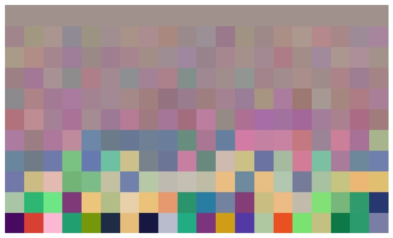
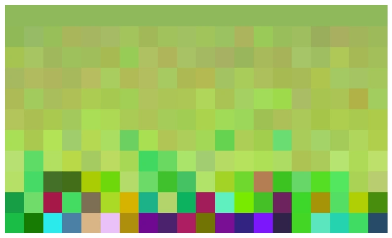
Each individual is a color. Its DNA is an RGB code. Its fitness? How close it is to a target color. Every generation, the fittest reproduce with random mutations applied to their color codes. Over time, the population converges: and it looks pretty!
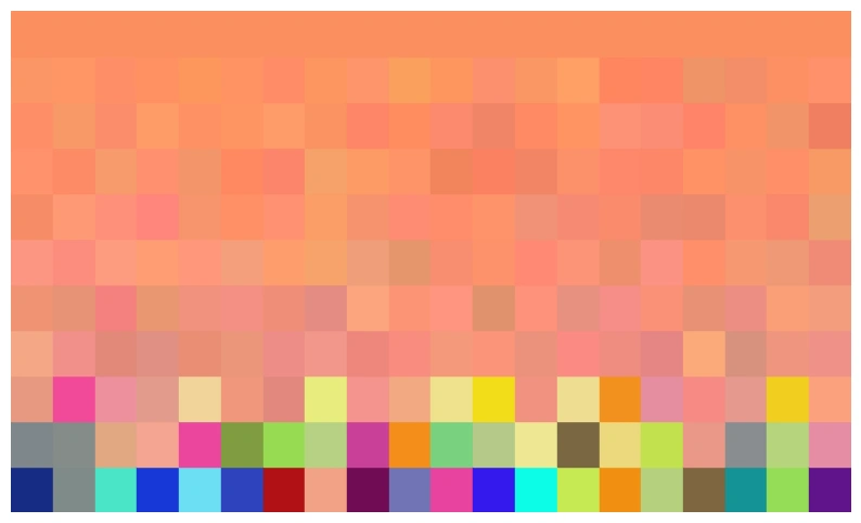
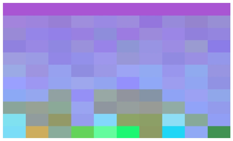
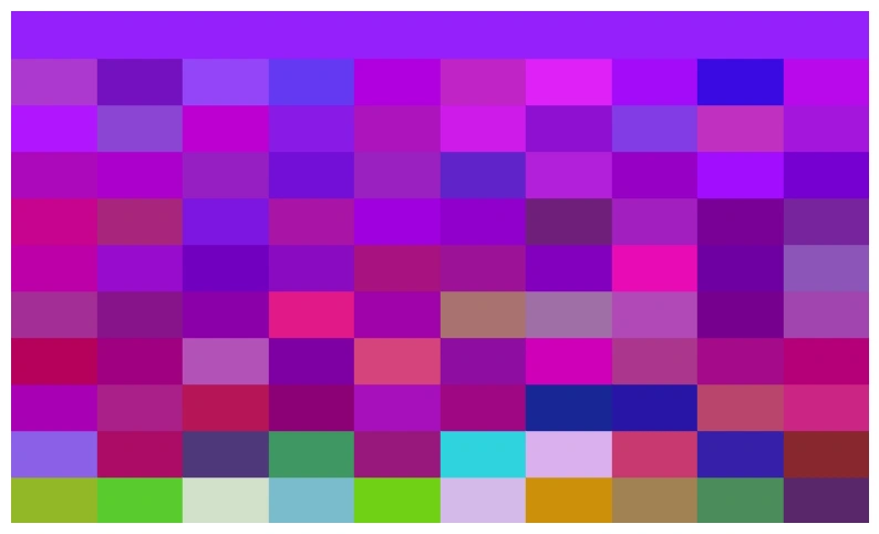
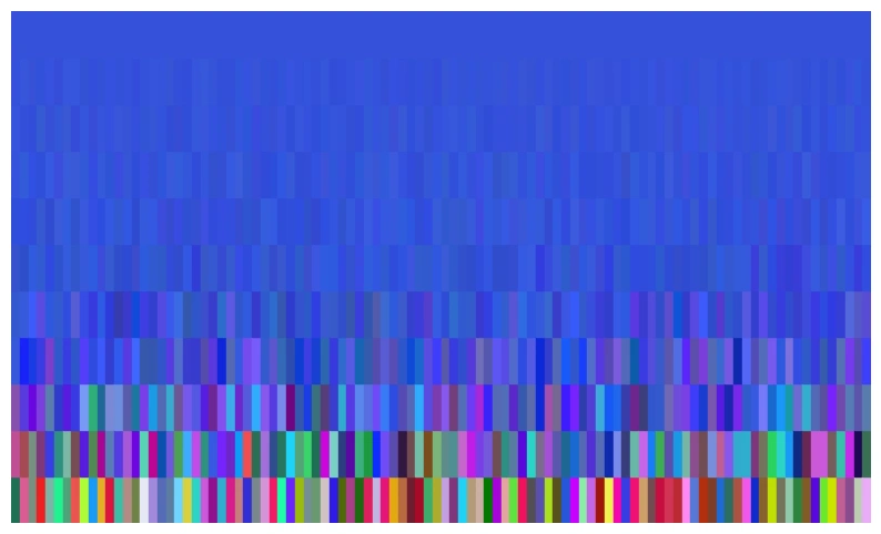
Each colored patch is an individual, each row is a generation. Time flows upward, with the target color placed in the top row.
Here, a random population gradually converges toward the target. Selection does its job.
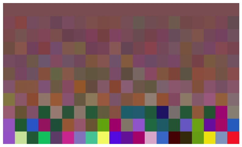
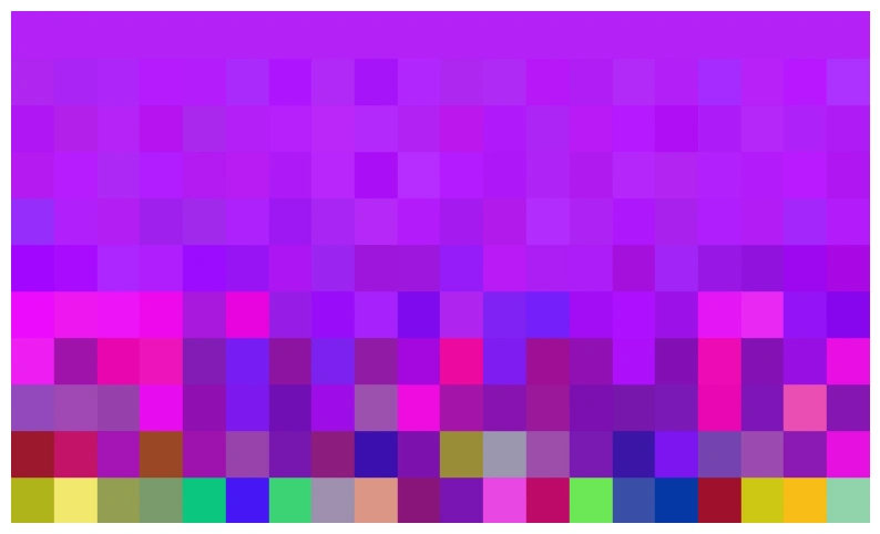
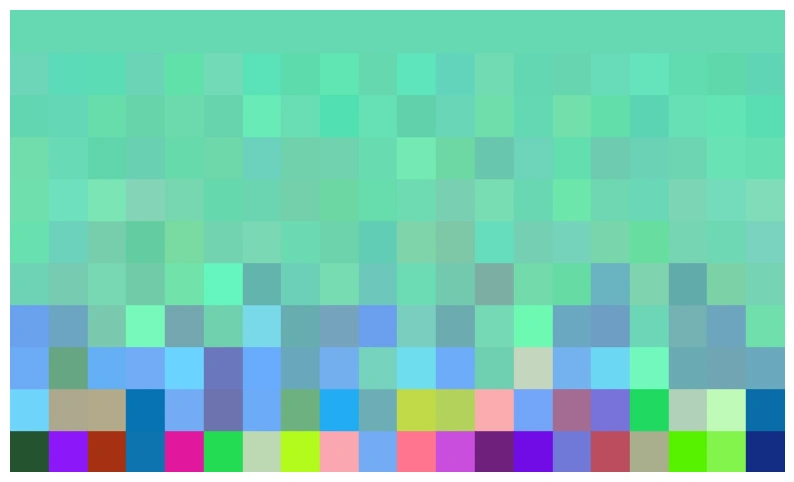
What happens with a smaller population? Less initial diversity makes it harder to explore the color space. The population converges too early and misses the target.
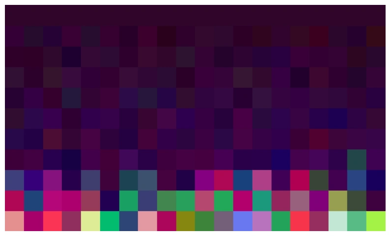
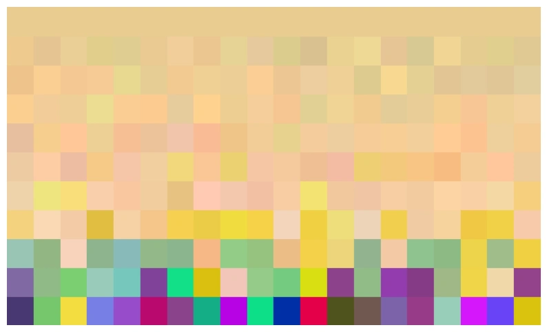
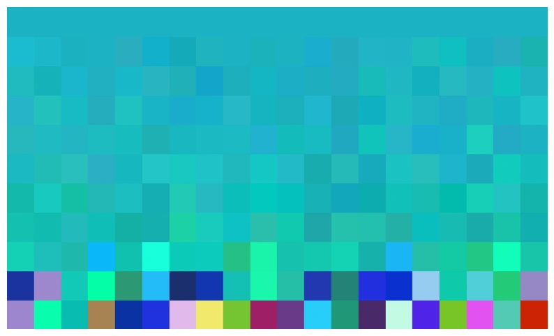
Cranking up mutation strength helps. Children can differ more from their parents, reintroducing diversity. Notice the greater variation remaining in the final generation.
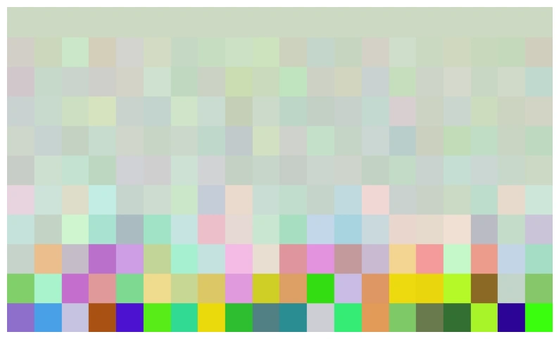
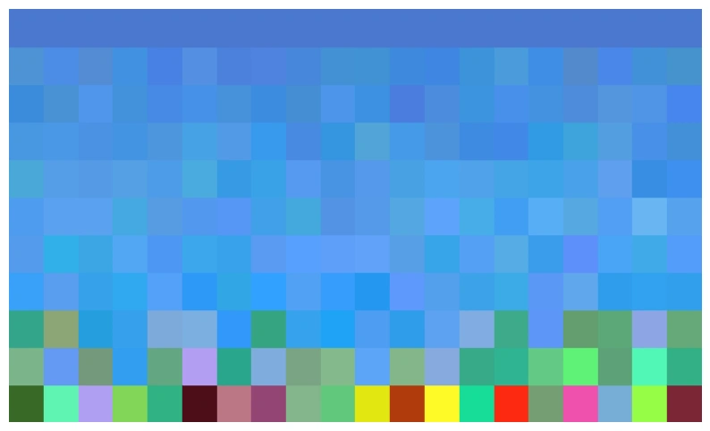
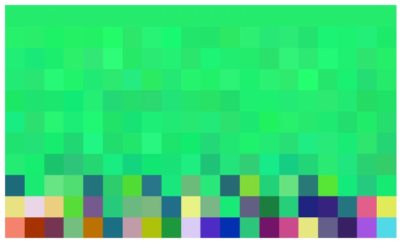
With a larger population (~100 individuals), there’s enough initial diversity to keep mutations small. The result: smooth, precise convergence.
Play with the code (in Processing).
More runs with different settings: