What if every place on Earth had its own unique color signature? This project explores the conceptual and visual intersection between geographic space and color theory, creating a chromatic atlas where locations are translated into their corresponding colors.
Just as every place has its distinct character — shaped by climate, culture, terrain, and countless other factors — this system assigns each location a unique color identity based on its position in the world.
There is multiple color representation systems, each with different properties and purposes. The familiar RGB (Red-Green-Blue) color space was designed for digital displays: [0,0,0] represents black, [1,1,1] is white, and [1,0,0] is pure red. Printers use the CMYK (Cyan-Magenta-Yellow-Black) system, mixing inks to produce colors on physical media.
However, neither of these systems accurately reflects how humans actually perceive color. Our visual system doesn’t experience color differences in a linear fashion — equal numerical changes in RGB values don’t necessarily result in equally perceptible color changes.
This is where the HCL color space (Hue-Chroma-Luminance) becomes valuable. Specifically designed to better align with human perception, HCL creates a perceptually uniform space where:
In HCL, equidistant colors appear similarly different to the human eye, making it particularly useful for creating intuitive color gradients and mappings.
Both our planet and the HCL color space can be represented using spherical coordinate systems, which creates a natural mapping between location and color:
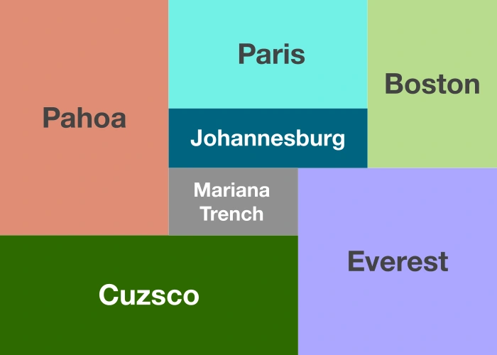
Through this mapping, places on Earth transform into specific colors in the HCL space. Places near the poles appear either bright (north) or dark (south). Higher elevations produce more saturated colors, while places below sea level appear greyer.
This system creates a visual language where geography becomes instantly expressible as color. The resulting “chromatic cartography” offers a new way to experience and visualize our world.
Below are the colors of eleven locations around the world. Each image represents the unique color derived from that place’s geographical coordinates: